This poster is for placing at train stations and inside trains to encourage the public to save time while taking train journeys by reading books. I am not suggesting that reading on trains is the only way to save time or even the best way to save time, but merely a means of saving time. I enjoyed drawing the train and putting people inside, even though it was a little tedious to cut them out precisely. The hard lines outside the train signify the swift passage of time, hence the advice to save every precious moment of it. The person outside the train is the main focus of the poster, and he is reading in a casual posture to show that reading on trains can be part of lifestyle and not something contrived.
Monday, February 26, 2007
Assignment 4
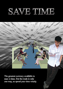
A poster placed at train stations and in trains
This poster is for placing at train stations and inside trains to encourage the public to save time while taking train journeys by reading books. I am not suggesting that reading on trains is the only way to save time or even the best way to save time, but merely a means of saving time. I enjoyed drawing the train and putting people inside, even though it was a little tedious to cut them out precisely. The hard lines outside the train signify the swift passage of time, hence the advice to save every precious moment of it. The person outside the train is the main focus of the poster, and he is reading in a casual posture to show that reading on trains can be part of lifestyle and not something contrived.
Tuesday, February 13, 2007
Assignment 3
Snake-counterskill:
The strong shall live and the weak shall perish.
That is the dominant law of nature.
Assignment 3 was pretty fun to do, although I had a big headache over fitting my story into ten frames. I needed about 11 or 12 frames to get all my ideas across. So I tried to squeeze some of the frames together, such as the first and second one, but worried that trying to communicate two ideas in one frame would make my story unclear. So I opted for fewer fight scenes so I could have one focal idea in every frame. I also tried to do more dramatic poses, but aggravated an old injury and had to give it up. Well, all in all it was an interesting assignment, and I had a good laugh with my mother over the hundred-over photos we had to take to get her expression and position right.
Monday, February 5, 2007
Assignment 2
Initial sketch
Levels of abstraction
Final symbol
This is the mask worn by Kurosaki Ichigo in the anime, bleach. I sketched the first image and
did the rest in photoshop. I abstracted it by removing first the designs, then the cracks, and changed the expression. For the generic symbol, that is not an angry expression. The big hole for the mouth allows you to express many mouth expressions such as a smile, sadness, surprise and etcetera, which is why I felt that this would be the beginning of genericness, because it signifies a mask that can take on any expression.
Assignment 1
8 sketches

4 roughs


2 prototypes

My prototypes look very different from my roughs. I had to change everything because people didn't get what my roughs were trying to communicate. I think I was trying to put too many ideas into the picture, at least for fantasy, but lacked the technical abilities to carry it forth. So I opted for a more direct, impactful representation.
I love reading fantasy books. I chose to use a dragon to signify fantasy because I think the connection is instant. Dragon = fantasy. The dragon is also breathing flames, which form my name, onto the book to link me, the book, and fantasy together. I wanted to really emphasize my name, so I used the contrasting colour of fire to grab attention.
I hate insomnia as it's something I've had since I was young. I placed the clock upon suggestions from classmates, to signify the lateness of the hour. I also tried to create a gloomy atmosphere by using duller colours. Again I tried to contrast the colour of my name with the rest of the colours. I realise, after presenting, that the moon should not be yellow if I want to use dull colours for everything but the name.
Subscribe to:
Posts (Atom)


